By Giovanna Truong (MSt Yiddish Studies)
Oxford’s former Schola Musicae stands tucked in a corner of the Bodleian Old Library quadrangle. In modern times, neither harmonized voices nor metred strums resonate from behind that wooden door; rather, a different rhythm altogether emerges. The clack of type, the punch of the press, the busy murmurs of students spelling letter by letter — these constitute the music of the Bodleian’s Bibliographical Press. As the first week of Michaelmas Term drew to a close, we History of the Book students discovered that this is where bibliophiles — too often caught poring over theory in the sterile reading room of the mind — can go to get their hands dirty.
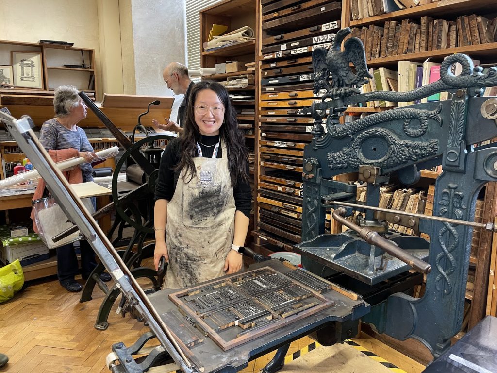
Under the guidance of Richard Lawrence, the press’s superintendent, we History of the Book students experienced firsthand the materiality of the book object.
Say we want to get words on a page. How should we do that? We could write, drawing out each letter with ink from a single pointy object. But what if we want to replicate the same words over and over again, ad infinitum? Instead, let’s pre-form the letters we want, raising a tiny piece of lead where we want ink to be laid down, and knocking back all of the places we want ink not to go. If we make a whole set of the alphabet, with many multiples for each letter, there’s practically no limit to the number of words, passages, and ideas we can convey by organizing and re-organizing the letters, and then smashing inked metal against paper. That is the concept of movable type.
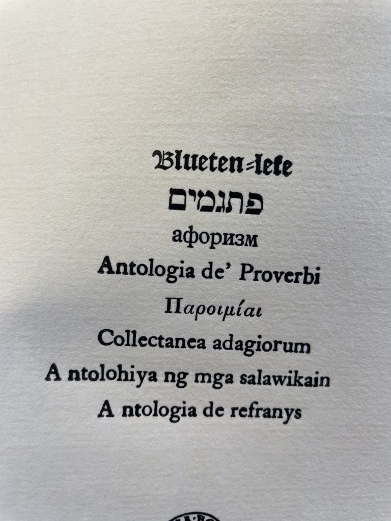
Well, it’s all easier said than done. Our stated goal was to print a pamphlet of proverbs, with one adage championed by each student. As good Oxford students with good Oxford tutors, we saw it through to the im-press-ive end.
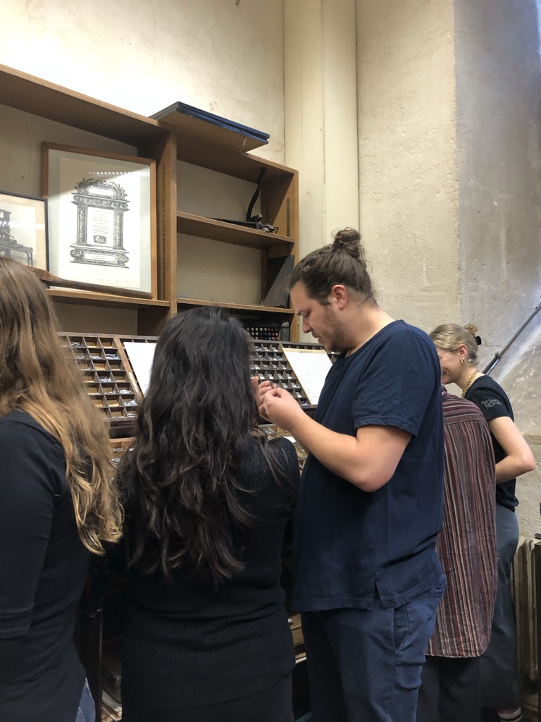
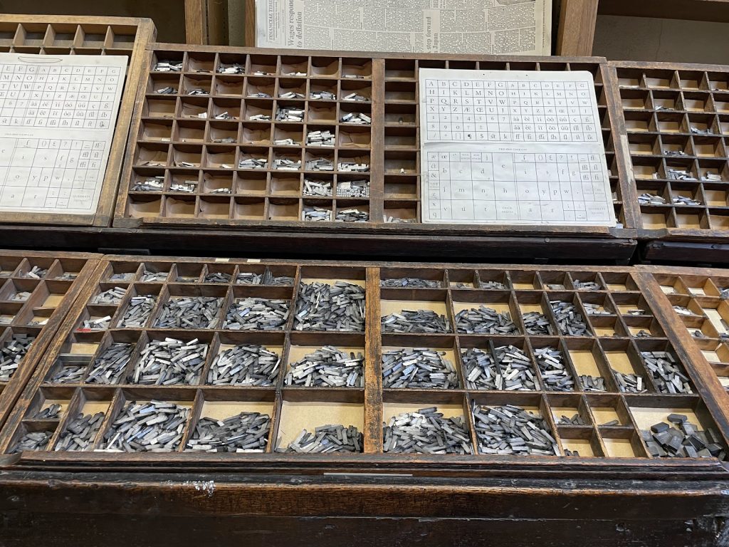
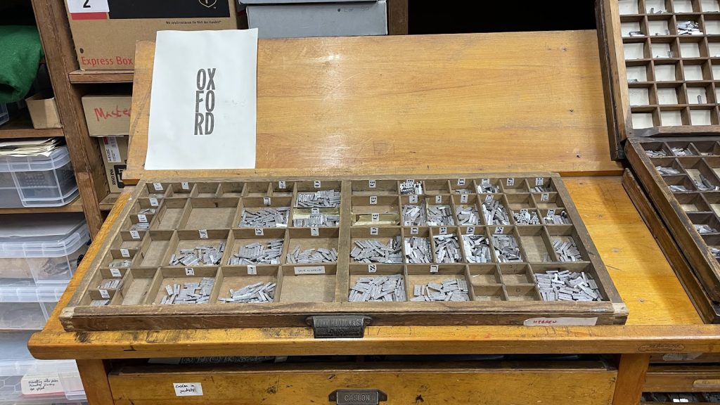
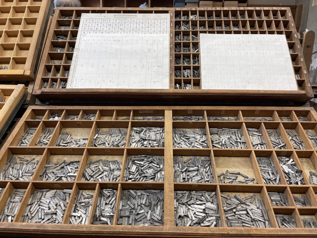
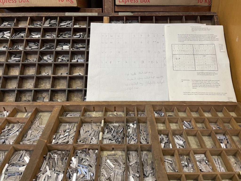
But to get there, we spent an hour and a half setting the type — that is, arranging all the letters in order. That meant choosing type piece by piece from cases with little compartments for each letter, space, or punctuation mark, orienting ourselves with little maps of the type cases, and trying not to get our letters upside-down or backwards.
It’s time for a full disclosure: I took a letterpress printing class in my undergraduate years, and I emerged as a letterpress apprentice. So you can trust me when I say that my classmates were setting fast. It’s not clear to me that any of them had even seen a case of type in their lives before, but they picked up the whole business very quickly.
Professor Lähnemann had suggested choosing short proverbs so that we could get out of the workshop in time for coffee. As Richard Lawrence told us, many typographic quirks can be explained by considering that printers wanted to get finished with a job to earn their commission and go out to the pub. If printers could save time or money with printing shortcuts, they did.
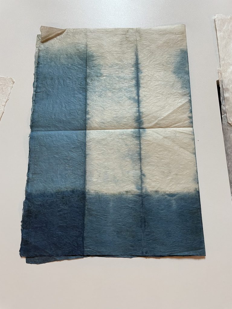
But in the interest of art, and because they were speedy enough setters to do so, some of my classmates printed multi-line proverbs with translations, and one student even scrapped her first proverb and set another one just before the pamphlet went to print. And we still made it out in time for a dose of caffeine and a presentation on Japanese paper textile (shifu) by Claire Bolton at the Weston Library.
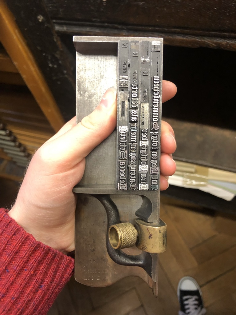
With our biscuits and tea consumed, we returned to the press. By this point, Richard Lawrence had “locked up” the proverbs, our names, and our title page in the frame that holds all the various lines of type in place (called the chase). This composition is called the forme.
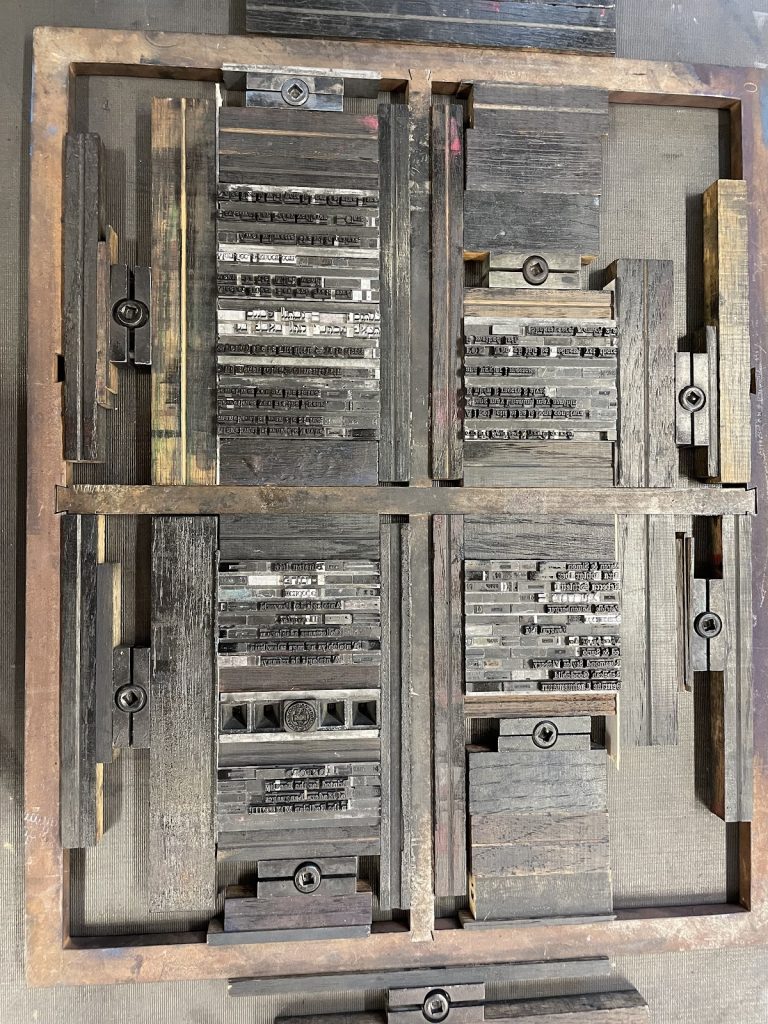
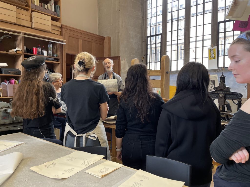
At this point, it is worth noting that the Bibliographical Press has an almost magical selection of typefaces. There are cases upon cases of beautiful lead type and wood type. Most impressive to me, there were also fonts (font = typeface + size) in Cyrillic, Hebrew, Greek, and, of course, Latin alphabets (with plenty of diacritics). (There is even a Chinese typewriter hidden away under a workbench.) If you don’t have type, you simply can’t print, as Richard Lawrence explained, and the type costs many times more than the press itself. The old Schola Musicae, then, holds a marvellous treasure — that is, to those who know how to use it.
Finally, the moment of truth! Richard Lawrence showed us how to ink our letters, position a piece of paper on the printing surface, fold it down to the chase, roll it all under a big lever, and pull with a satisfying clack! Then, rolling the paper back out, pulling it from the forme, we revealed the fruits of our labour.
How wonderful is the kiss of the ink against the paper — how delicate and precise the letterforms! How fulfilling is the feeling of one’s own handiwork in one’s hands! How captivating are one’s own words struck into being on the page!
How lovely, the History of the Book class learned, is letterpress!