As a student on Oxford’s MSc in Digital Scholarship, I had the opportunity to complete a practicum with Taylor Editions this Trinity term. The practicum component of our course is designed to give students the opportunity to experience how a real digital project is run, and to develop and hone further skills within the digital humanities in a practical environment. This year, the Taylor Editions practicum revolved around two of their recent exhibitions: Epic! Homer and Nibelungenlied in Translation and Kafka’s Languages.
I am using social media data (specifically from TikTok) within my own research for my dissertation project, which explores how BookTok has impacted publishing and literary trends within the fantasy genre. Given my own interest in social media, helping with online promotion for each exhibition was a natural fit. As there was no existing TikTok account, I created one for History of the Book (@historyofthebookoxford), which already has X (Twitter) and Instagram profiles. This presented a unique challenge and opportunity to discover what kinds of videos and posting strategies had the most reach, as I was starting with a brand new account with no followers and no influence from TikTok’s algorithm. From our first video on May 6 until the time of writing on June 3, the account went from 0 to 31 followers and had a total of 288 likes across all videos. According to TikTok’s analytics feature, we had a total of 6, 653 views, 108 profile visits, and our content was shared 25 times. Our key traffic source was the For You page, which is how 80.7% of our audience found our content, with the Search feature attracting 13.2%, Following (followers being specifically shown our content) 3.5%, and the Personal Profile 2.3%. For most individual videos where this information was available, at least 80% of views came from the For You Page. Over the course of the practicum, I started following accounts related to Oxford, the exhibitions, and book history, such as @bodleianlibraries, @oxfordmedievalstudies, and @oxfordkafka. I began interacting with other users’ content by liking posts and reposting videos that were relevant to the exhibitions (primarily posts promoting other Kafka exhibitions around Oxford). TikTok has not published any official guidelines or explanations of how their algorithm works, but engaging with other users is typically considered good practice to encourage engagement with your own content across social media platforms. I also experimented with posting at different times of the day to see if this affected views/engagement. The earlier videos gained significantly more views, with videos typically only gaining 30-50 views once I began posting consistently. These lower numbers weren’t unexpected since I was using a new account and posting about a very niche subject, and so I was pleased to at least see some consistency in engagement and have a few videos still reach 100+ users. Though this is not officially confirmed by TikTok or other social media platforms, I assumed that my first few posts would gain more views as this was the case in my own and my friends’ personal experience – if new posts from users attract higher numbers, it would presumably encourage users to continue posting and using the app. That said, I found that the time of posting did not seem to have a noticeable impact on how my videos performed and with this in mind I typically tried to post around midday as this was the most sustainable for me as I began managing multiple “series” between both exhibits.
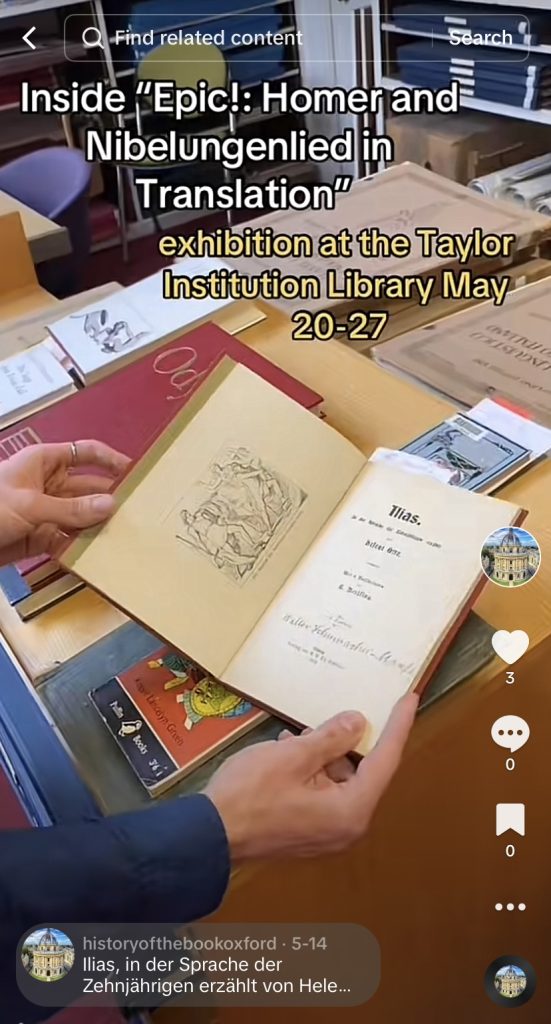
For the “Epic!” exhibition, I recorded curators Henrike Lähnemann, Philip Flacke, and Mary Boyle discussing texts that would be included in the exhibition. We had 16 videos total, and I posted one a day to TikTok in the lead up to the exhibition as a “behind the scenes” style look into the exhibit and the kinds of materials that would be featured. Each video included the exhibition title and information about where and when it would take place, and the caption always included bibliographic information about the text discussed. These videos were some of the best-performing on our account, with the first three videos gaining between 750-1605 views. While none of our videos attracted any comments (apart from this video, which drew a user to make the connection between Homer and Homer Simpson), these higher performing videos usually attracted likes and saves from a portion of the viewers – saves were particularly interesting and desirable as it implies that the content has resonated with the user in some way and is perhaps saving the information to attend the exhibition. I also reposted these videos to the existing @historyofthebookoxford Instagram account as reels, as these videos most closely fit the kind of content already being posted on that account. These videos typically had 75-150 views.
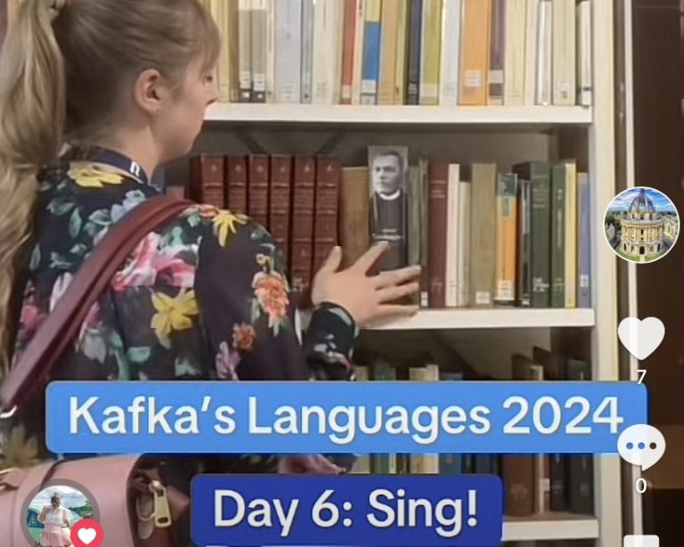
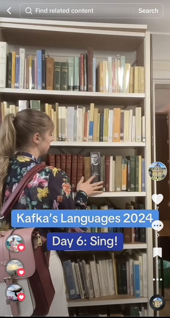
For the Kafka exhibition, I started a social media series where I tried different language learning tactics to see how much German I could pick up before the exhibition’s start date. I included clips of recognizable Oxford locations such as the Radcliffe Camera library early in each video to capture the attention of users who were interested in the University, as well as clips of the Taylor Institution Library to connect the content of the video with the exhibition. I tried to keep these videos humourous (for example, I started every video with “Day _ of trying to be better at German than Kafka was at Hebrew,” and included my own flubs with pronunciation and reactions to particularly challenging words) to keep viewers engaged, and to compare this style of content with the more factual approach to the “Epic!” videos. These videos were very connected to the physical space of the Taylor Institution and different engagement tactics that the exhibition and library teams employed. By the library’s enquiry desk, we put up bulletin boards/interactive objects asking readers to indicate what languages they spoke, to label items in a dollhouse with as many languages as they could, and to write their own interesting suggestions/tactics for language learning. The latter resource is where I pulled the majority of the suggestions that I tried in the videos. Once these were up in the library, I started showing the boards in every video and directing viewers to them to post their suggestions. Emma Huber and the Taylor Institution’s social media team also posted about these and my own videos on their X profiles to drive traffic. Over time I did not see a significant difference in how the “Kafka” videos performed on the platform compared to the “Epic!” series – early videos amassed more views and likes but they eventually evened out to the same kind of numbers. Had I continued both series for a longer period, a more significant difference in engagement may have developed between the styles of videos. Finally, we recorded a handful of videos where Henrike Lähnemann and Emma Huber describe some of the language learning resources displayed in the “Kafka’s Languages” exhibition alongside the author’s Hebrew notebook. I have been posting one a day since the exhibition’s start date in a similar vein as the “Epic!” videos to provide a closer look at some of the materials on display. These videos have had similar views and engagement as the other series.
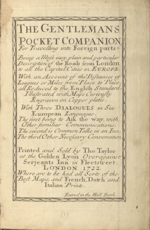
In addition to the social media videos, I took on an encoding project related to the Kafka exhibition and language learning. I created a TEI/XML digital edition of a 1722 book titled The Gentleman’s Pocket Companion for Travelling into Foreign Parts, which will be availabe on Taylor Editions. The text was originally published by Thomas Taylor in London. This was a very interesting project for me, as all of my previous experience with digital editions and TEI/XML encoding has been with manuscripts. While completing my undergraduate degree, I had the opportunity to volunteer with The Canterbury Tales Project, where I was working with The Canterbury Tales manuscripts through the textual communities platform. In Michaelmas term of this year, I completed a TEI/XML project on the first chapters in Notebook A of Mary Shelley’s draft of Frankenstein. I had expected to find working with printed materials simpler in many respects, but I ran into several interesting challenges over the course of this project.
Given the time limit of my practicum, I was not able to encode the entire book, and so my edition includes 14 pages of the text. The images of the pages were taken either by Emma Huber using the library’s scanning equipment, or myself using my iPhone when the scanned images did not have a high enough resolution to be readable. The book is divided into different sections, the first contains maps and tables of different parts of England and Europe describing the distances between major cities, and the second contains language tips for six different European languages: English, French, Italian, German, Spanish, and Dutch (Flemish). Since the Kafka exhibition is centred around language learning, the latter section was of the most interest and importance for this project. However, I still wanted to represent each “kind” of page in my edition, and so I decided to encode all of the front matter that describes what the text actually is and where it is currently held, as well as the first map and table before jumping ahead to the first section on language which claims to provide aid to travellers “to ask the Way, with other familiar discourse.”
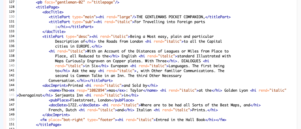
Using the xml:lang attribute, I set the primary language of the document to English using the three-letter IANA subtag “eng” (this was selected over the two-letter subtag throughout the document as this is standard practice for Taylor Editions). The first page was quite simple to encode. It contains the Taylor Institution stamp alongside collection and presentation information. I used <figDesc> to describe the circular Taylor Institution stamp and then the <p> element to contain the lines of text describing where it is held. The next page contains the title and publication information of the text; I could have used the <p> element on the next page and <head> to signify the title but chose to use <titlePage> to contain all of the information on this page as this more accurately and specifically describes its purpose. I used <titlePart type=“main”> and <titlePart type=“sub”> for the main and subheadings, followed by <titlePart type=“desc”> for the larger block of text that describes the contents and purpose of the book. <docImprint> was used for the publication information, and as Thomas Taylor is abbreviated to Tho: Taylor, I used <ex> to note the full name (I chose <ex> over <expan>, as the former is specifically for additions made by an editor or transcriber). <fw place= “bot-right” type= “footer”> was used for the final line “entred in the Hall Book” and <hi rend=“italic”> was used throughout the page to signify what was italicized and what was regular script.
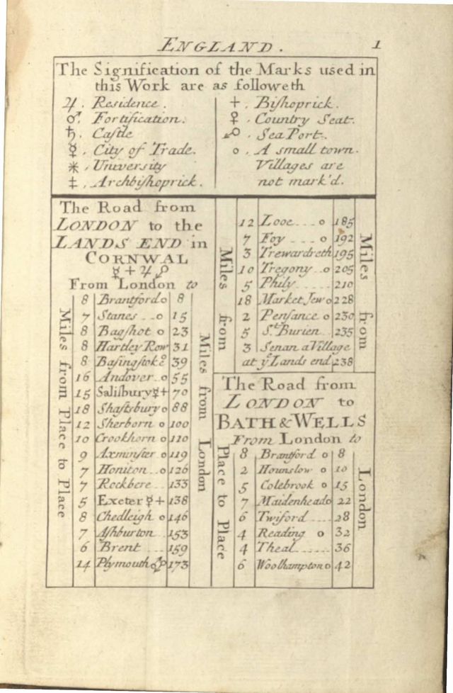
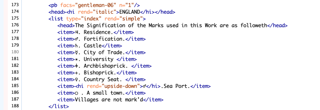
I used the <figDesc> element to describe the map, and simply described it as a “map of Europe” alongside the title information enclosed in a box in the upper right corner using <figure>, <head> and <p>. Had I had more time, I might have considered doing something more visual such as <surface> and <zone>, but since this section was not of primary interest, I chose to use the simpler approach that better suited the needs of the project. The page pictured below was the most difficult and time-consuming of the entire project. I had initially attempted to replicate the appearance/organisation of the physical page in my encoding using <table> and essentially creating tables within tables as I wanted to create a diplomatic version representing the materiality of the text as closely as possible. This had (mostly) worked until the very last section “The Road from Bath to Wells” when Oxygen XML Editor did not want me to split my individual cell into additional columns. After much frustration and fiddling, I followed the advice of Emma Huber and decided to simply represent the information in the tables as closely to the author’s intention as possible by splitting them up into separate tables. My digital version includes a table for “The Road from London to the Lands End in Cornwall” and a separate table for “The Road from London to Bath & Wells.” This does not represent the visual elements of the material page, but I think more accurately and clearly represents the information for any readers of my edition, and so this page prompted me to reconsider my approach to the project to make decisions based on what would be more readable/useful to my audience – likely researchers and perhaps exhibition goers who find my edition on Taylor Editions. Another interesting challenge was the list of symbols and their meanings in the first part of the page. They are primarily astrological/zodiac symbols, and so I was able to find them on Unicode and put them directly into my transcription/encoding, however, the mark for Sea Port caused trouble as it’s an upside down Mars symbol and so I could not find the proper orientation online. I used <w rend=“upside-down”>♂</w> to indicate that the symbol is flipped.


Following this page and my <gap> of 39 pages, I moved onto the language section of the text. Each page is broken into three columns that essentially transcribe a conversation in three different languages (six total). I used the <div> element to separate each column and within the element tagged them as columns, and described the language for each section using xml:lang and the corresponding IANA subtag. <head> was used to describe the language title, and each was given an xml:id so that I could use the “corresp” attribute to connect them to each other. <p> was used for the introductory description that introduces the chapter number and its purpose – each was also given an xml:id and corresponded to the same sentence in each language. Throughout the chapter, the conversation is between two speakers: speaker A. and speaker B., with a small cameo by speaker C.. Rather than use <p>, I used the <sp> element to indicate that each line represented a portion of dialogue and tagged the identification A., B., or C. as <speaker>. Each line was given a unique xml:id so that I could use the “corresp” attribute to connect it to the corresponding line of dialogue in the other languages. <hi> was used to indicate any text in italics, the centre language on each page (French and Spanish) is written primarily in Italics with the title in regular font, while the languages on either side of it are written in regular font with their titles in italics. This seems to primarily be used for aesthetic purposes to further break up each language from those around it. After much contemplation between myself, Henrike, and Emma, I ultimately decided to encode the line breaks in the dialogue to show how phrases are aligned. It is very unlikely that there is a perfect line-by-line equivalence, but it seemed important to show how phrases aligned as accurately as possible considering the language learning purpose. These pages should also display as six columns across, so that a reader may see each language transcription side-by-side.
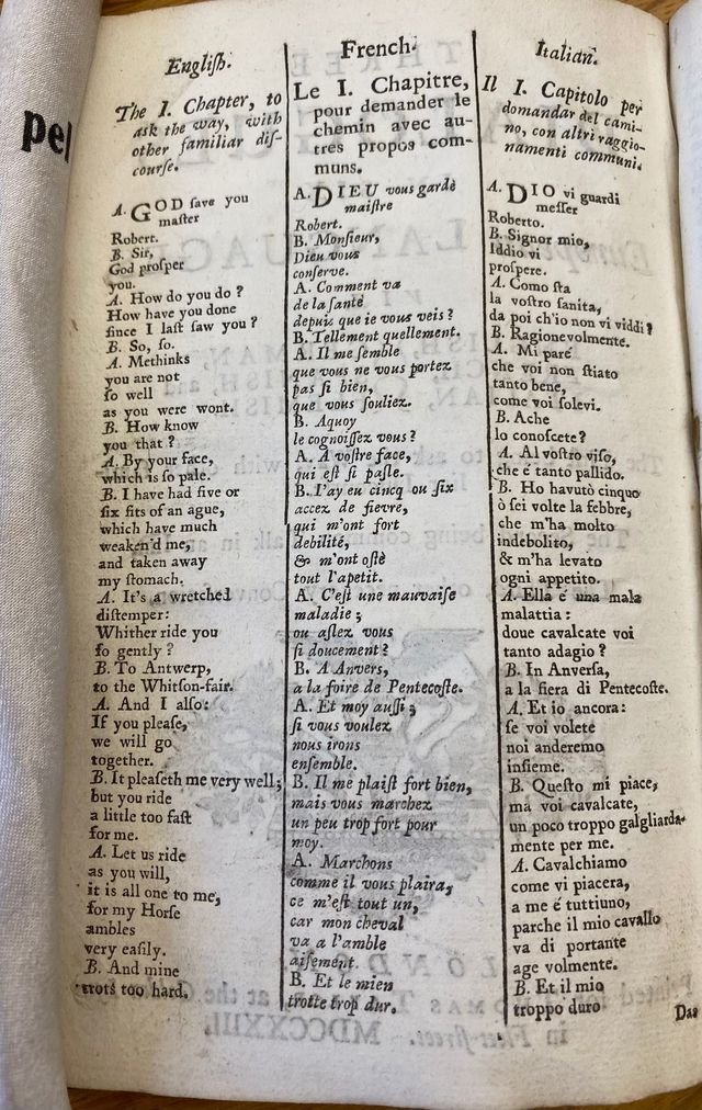
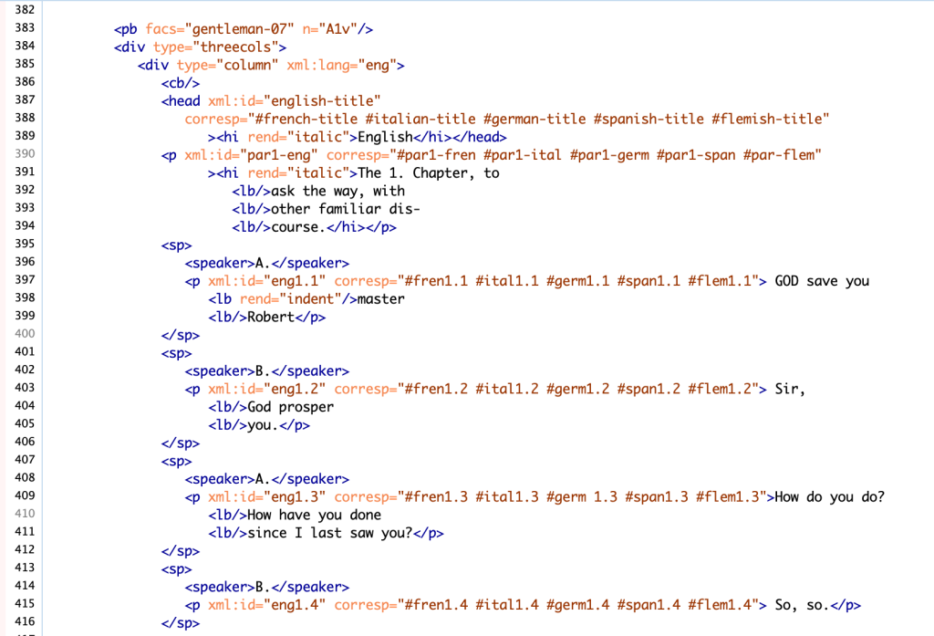
I think that this book presents an interesting approach to aiding travellers with language. The conversation that this section details is about “asking the way”and while it is certainly based around direction, it seems like such a specific context and set of phrases that I would be surprised if it was actually useful to an everyday traveller, though I do think the emphasis on conversational usage is very intriguing and certainly provided an enjoyable experience for encoding. I had expected to find it much more challenging to encode in languages that I don’t speak, especially considering that the book was published in 1722 and so is hardly using a modern vernacular. Instead, I found it reasonably straightforward, and though online translation tools are not known for being the most accurate, I occasionally used Google Translate if I was unsure about a certain letter. Since I had the exact English translation in the book already, I knew what the word was supposed to be and could try both versions to verify my reading, though it would be very helpful to have native speakers look at both the original document and my transcription. Creating this edition challenged me to think about how visual organisation may aid or impede language learning, and though my inclination was to create something that was as close as possible to the material page (likely an instinct from my work with manuscripts) thinking about structure and different representations for readers prompted me to make editorial decisions that I hope are beneficial to anyone reading my edition.
