By Molly Bray (MSt in Medieval Studies)
For our first session as book-historians-in-training, we asked the question, ‘what is a book?’ Is it the form, the function? Now, for our second session, we get to see and, indeed, operate the mechanics that make one. Held behind a large wooden door and the once-accurate waymarker of ‘Schola Musicae’ is the Bodleian Library’s own bibliographical press. It is here that we would get our glimpse behind the curtain, as it were, of the pieces that must be in place to create a book.
Given that we only had a few hours, a whole book would be ambitious; instead, we were to print invitations for the upcoming launch of the Taylor Edition of Hans Sachs’ Reformation Dialogues. Under the guidance of Richard Lawrence – master and custodian of the Bodleian Library’s Bibliographical Press – and Henrike Lähnemann, we began with the familiar: our own names, first and last.

R: Classmates Montgomery Powell and Edie Young share their typeset names.
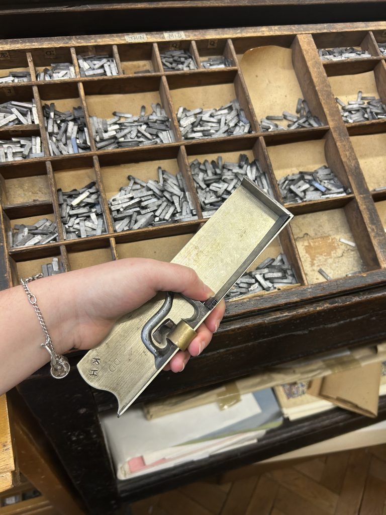
Working in pairs, as printers’ apprentices would have done, we each gathered around a typecase with a composing stick in our left hand, ready to set with our right. The cases hold the alphabet of moveable type, cast in lead: upper case in alphabetical order for less frequent letters, lower case for the most common ones. Small compartments divide each letter, ligature, space, and punctuation mark from the next, with the larger compartments occupied by the most frequently used letters, whereas the smallest ones are for those less common letters.

Letter by letter, we gradually form our names along the composing stick, moving from left to right so that when it is printed, the inverted line will read correctly. Each piece type is remarkably small and slots in one after the other into the composing stick. We are told to hold down the line with the thumb of our left hand (the one holding the composing stick) to keep any pieces of type from shifting – doing so allows us, too, to feel that the type is being placed correctly: each has a small nick on its upper edge that signals it is in the right place.

Having passed this first test of spelling out our names and being better acquainted with the typecases, we now move on to the tri-lingual title for our invitation – for the launch of Hans Sachs’s first Reformation Dialogue in German, Dutch, and English. We set the titles in 24-point Old English type, with my printing partner, Nina, and I in charge of the Dutch ‘Een schoon disputacie’. In setting our type (including a necessary revision once we noticed we had forgotten the ‘h’ in ‘schoon’), we realized it was the spacing rather than the spelling that took the greatest amount of time. For, every blank space on a typeset page is actually quite the opposite – the absence of ink requires the presence of a small piece of lead, shorter than the rest of the letters in the line, to literally hold space. As our line was to be justified in the centre of the page, we needed to ensure the exact same width of spaces would be lined up on either side of our letters. A meticulous process of trial and error ensued as we fitted increasingly small wedges of lead onto our composing stick. But, at last, it was complete!

Our line was then joined by its page-mates (the German and English titles, along with ‘Oxford MMxxiv’ at the footer) in what is called the ‘chase’: a steel frame that contains the laid type. Wooden blocks called ‘furniture’ and metal ‘quoins’ must fill up any empty space between the type and the edges of the chase, lest the type moves on the press and you end up with an alphabet soup of a print! Once all the puzzle pieces are in place, Richard ‘plains’ the type with a wooden block and tightens the quoins. Then, the whole unit is called a ‘forme’ and is ready for printing.

We start the process of printing on the Albion press (with a brief interlude on the wooden hand press next to it, on which we print a woodcut of a printing press not unlike the one we were presently in). With the forme in place, Richard readies the dampened paper behind the frisket, which he then cuts down to size so that no unwanted space on the page is inked in the process.

Richard then inks the type using a sticky oil-based paint, closes the frisket over the paper, and lowers it onto the forme before wheeling it under the platen with a crank lever. And now, the moment of truth: he pulls the bar, causing the plate to lower and push the paper against the type. With that, the miracle of print is complete, and we see our words laid out no longer as a mirror image but as stark black forms (albeit with a few typos!) on a white page.

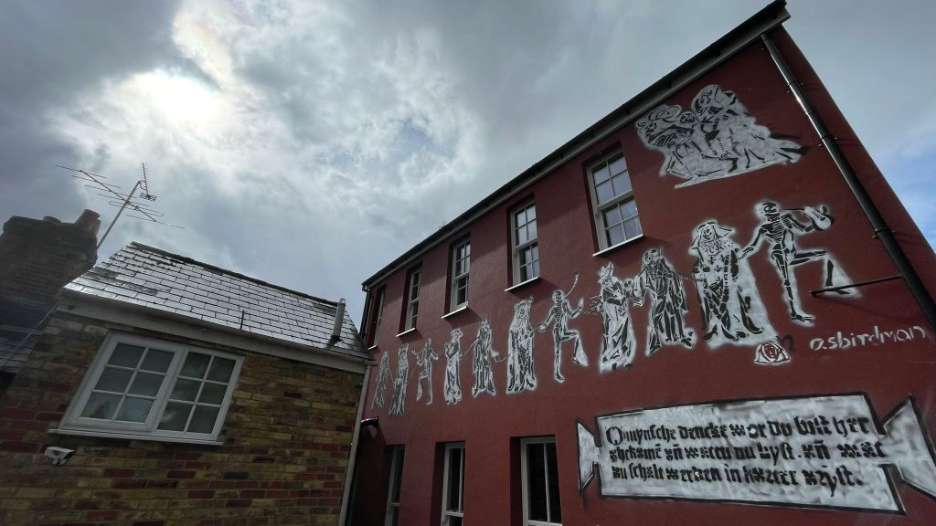
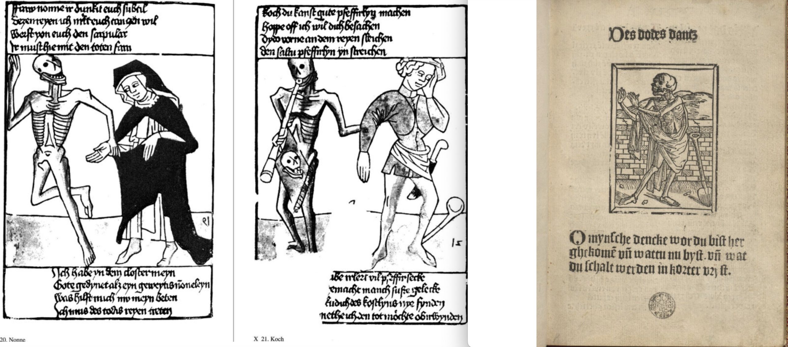
While our invitation itself was largely text rather than image, we had the distinct pleasure of being joined by Alex Singleton, a local printmaker and mural artist. Having recently completed a mural for Henrike Lähnemann in the form of a larger-than-life Danse Macabre pirouetting around her home, Alex brought in linocuts of the same motif so we could sample another form of printmaking besides letterpress.


Alex shared the process of lino-cutting with us, wherein you carve away the negative space of an image, usually drawn in permanent marker, using a sharp carving tool. In doing so, Alex imparted a salient message: that, in artmaking (especially graffiti/murals), there are no mistakes – anything can be layered, altered, or transformed.

Alex demonstrated the printing process using his linocuts, which, in many ways, follow the same mechanics as the letterpress: ink is applied to a textured surface, which is then pressed into paper to leave behind an impression. Now, the dance troupe cavorts in the Bodleian, not just on Henrike’s walls! Maybe Schola Musicae is an apt name after all…

I’ve always been intrigued by this process and now have a brilliantly concise blow-by-blow of the process! It’s a wonder words were ever allowed to grow beyond 4 characters long! Thank you for the images too…the lino print skele-fellows are an extra treat!